Source: Open Culture August 17th, 2020
Twenty years after his death, it’s cooler than ever to like Edward Gorey. This is evidenced not just by the frequent posting of his intensively crosshatched, Victorian- and Edwardian-period-inflected, grimly comic art on social media, but by the number of artists who now claim him as an influence. Where, one wonders, did they come across Gorey in the first place? Having published more than a hundred books in his lifetime (if often in small runs from obscure presses), he certainly put the work out there to be found.
But it was the much more well-known books of other writers like Charles Dickens, Joseph Conrad, T.S. Eliot, and Herman Melville that first propagated Gorey’s sensibility of, as The New York Times‘ Steven Kurutz puts it, “camp-macabre, ironic-gothic or dark-whimsy.”
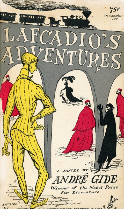
Gorey designed the covers for these books and others between 1953 to 1960, when he worked at the art department of publishers Doubleday Anchor. He had been tasked specifically with their new series of paperbacks meant to be “serious,” as opposed to the abundance of cheap, lowbrow, and often salaciously packaged novels that had inspired the term “pulp fiction.”
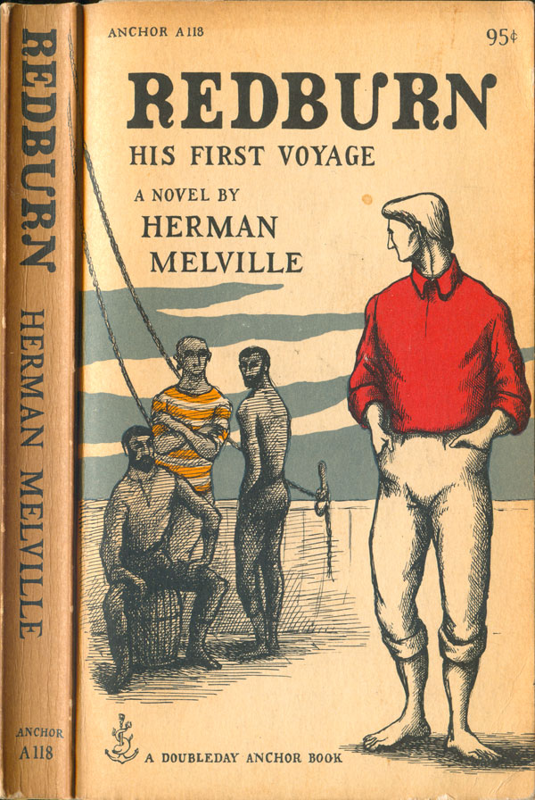
Of the first 200 titles in this series, says Goreyography, “about a fourth of these have line drawn covers by Gorey.” Even when other artists (the lineup of whom included Leonard Baskin, Milton Glaser, Philippe Julian, and Andy Warhol) drew the illustration, “Gorey then designed the finished product lending a uniform appearance to the whole line.” You can see a variety of Gorey’s Doubleday Anchor paperback covers at Lithub, the most Goreyesque of which (such as Joseph Conrad’s The Secret Agent at the top of the post) not only bear his illustrations but contain nothing not drawn by Gorey, text and colophon included.
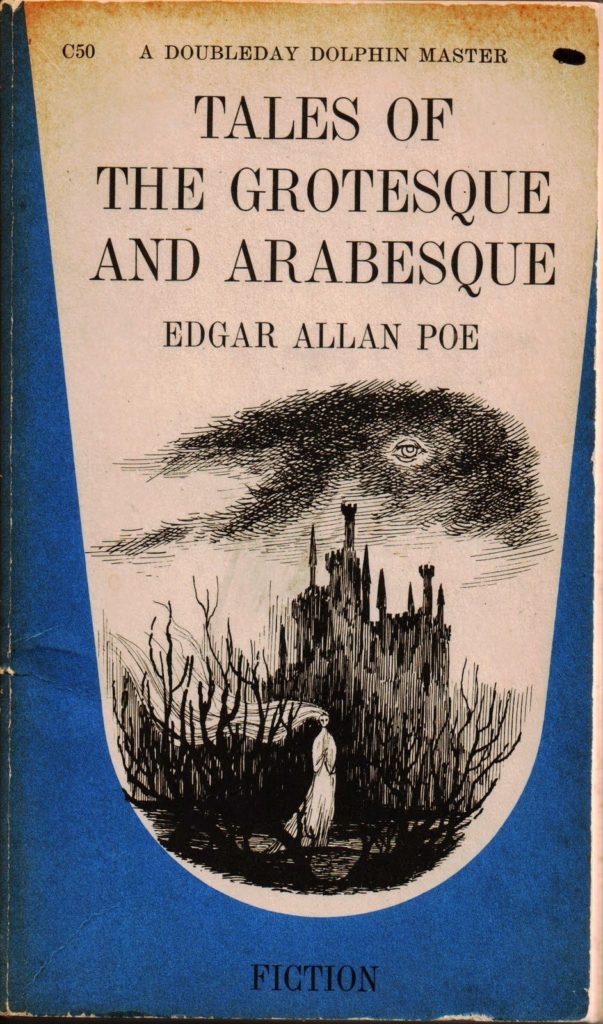
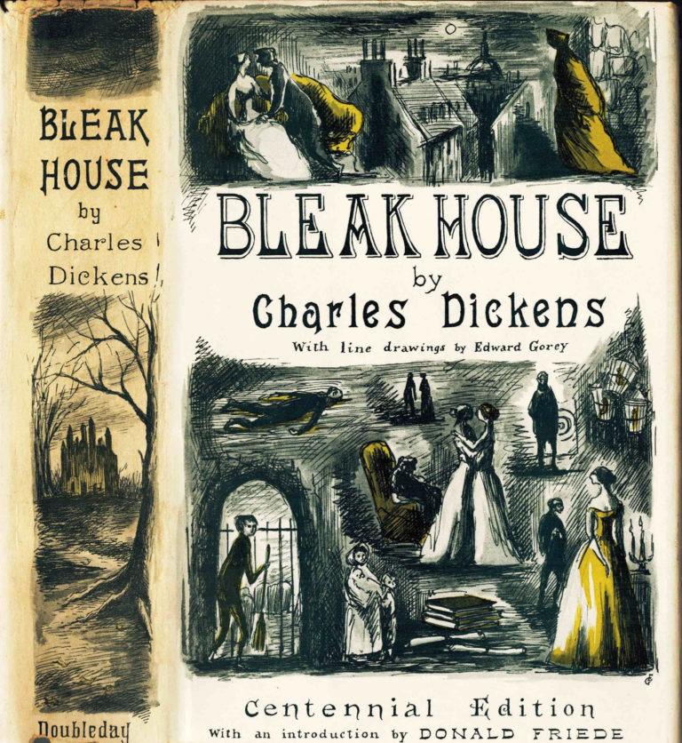
“When these covers first appeared against the backdrop of mass-market covers in general,” according to Goreyography, “they were hailed as ‘modern’ and ‘arty.’ Print magazine praised ‘a feeling of unity… a quality of their own.'” The end of Gorey’s time at Doubleday didn’t mean the end of his work on others’ books: in the 1970s, for example, he contributed suitably eerie cover and interior art to John Bellairs’ young-adult novel The House with a Clock in Its Walls and five of the sequels that would follow it. It was in Bellairs’ books that I first encountered the visions of Edward Gorey. More than a few readers of my generation and the generations since could say the same — and also that we’ve been pleasurably haunted by them ever since.
See more covers over at Lithub.